Pulse Design System Documentation Site
January 2025 - November 2025
Problem Statement
The Digital Pulse design system (DS) team started a unified documentation initiative in early 2025. The resources product designers relied on to deliver solutions that were accessible, brand-aligned, and consistent with content guidelines were scattered across multiple portals and sites throughout the organization—such as SharePoint and Confluence to name a few.
This fragmentation made it difficult for teams to find the right guidance at the right time and often resulted in duplicated effort, outdated information, or confusing guidance.
Goal
The goal was to bring as much content onto a single platform as possible and provide a clear information structure with intuitive navigation.
Some resources—such as the CVS Accessibility Wiki—had been hosted on SharePoint for a long time. Due to their size and long-term ownership, it would have been unreasonable to migrate them to a different platform. Instead, the unified documentation site would provide contextual links to relevant external content that needed to remain where it was, while still feeling like part of a cohesive system.
Platform
The Pulse engineering team already had a publishing platform—Docusaurus—for their technical documentation. It had matured over several years and was meeting their needs well.
Since the design system team did not have the budget to invest in a third-party CMS, the decision was made to leverage this existing solution and adapt it to support design system documentation.
Stakeholders
-
Pulse leadership
-
Pulse creative design lead
-
Pulse platform designers and engineers
-
Pulse accessibility designers
-
Content strategy leads
Plan
Discovery
-
Inventory of all existing documentation resources
-
Competitive research
-
Evaluation of Docusaurus
Site Architecture & Navigation
-
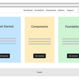
Wireframe iterations
-
Interactive low-fidelity prototypes for testing
-
A/B testing to gather feedback, identify user needs, and surface pain points
-
Iterations based on user feedback
-
Final proposed site architecture reviewed and approved by stakeholders and leadership
Design & Execution
-
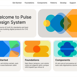
High-fidelity mockups
-
Stretch goal: build a live prototype in Docusaurus
Once the plan was approved by leadership, I moved into execution.
Discovery results
-
I started by locating and documenting all existing resources across the organization that I either wanted to pull into the site or reference from it. I met with accessibility designers, content strategists, and Pulse designers to align on findings, expectations, and gaps.
-
I also conducted and documented comparative research of publicly available design system sites in Miro. I was specifically interested in systems that provided guidance for both web and native platforms, and there were only a handful that truly addressed both.
-
One particularly exciting discovery was that Docusaurus could utilize Pulse React components. This meant we could truly “dogfood” our system—using our own components to build the documentation site itself. It also opened the door to integrating design tokens and supporting light and dark modes out of the box.
A/B Testing
After completing research, iterating on site architecture, and creating wireframes, I felt ready to test my ideas. User testing became a critical tool for validating assumptions, pressure-testing concepts, and understanding how designers would actually navigate the site.
I consider this step one of the most important parts of the process, so I invested a lot of time in preparation. I reached out to several solution designers, and they were enthusiastic about participating.
Testing setup:
-
Three distinct navigation flows (interactive Figma prototypes)
-
8 participants
-
50-minute sessions
Task:
Participants were asked to navigate from the homepage to Button documentation across all three platforms—Web, iOS, and Android.

Testing: Key Takeaways
-
The three-tier navigation resonated with all participants.
-
Designers preferred browsing components alphabetically. At the same time, they liked seeing components grouped by category—as long as those groupings lived outside of primary navigation.
-
The matrix-style component table was a clear hit. Designers were excited to see components listed side by side by platform, and they especially valued component status indicators such as "available", "to do", and "not applicable for this platform".
-
Most participants found the segmented button for platform switching in the side panel interesting, though somewhat unorthodox.
-
Search stood out as one of the most positively received features. Since this was the first time many designers had access to search within Pulse documentation, it was often their instinctive first action—several participants immediately used it to find the Button component.
-
All participants were able to accurately (or very closely) predict what content would live under the Foundations section.
-
Designers also responded positively to seeing Components featured as a prominent tile on the homepage.
-
Only one participant preferred Web, iOS, and Android to be treated as three separate content “buckets.” The rest favored having platform-specific component guidance in close proximity and expressed that linking equivalent or functionally similar components across platforms would be especially helpful.
-
Feedback on component-level tabs—Usage, Code, Accessibility, and Content Strategy—was evenly split across participants.
Aligning Insights with the Pulse Team
I brought the testing results back to the Pulse design system team, with a focus on ensuring that user needs and ideas aligned with the designers who would be authoring and maintaining the documentation.
To do this, I organized and moderated a series of discussions and working sessions. We reviewed findings together, zoomed into individual site sections, and workshopped solutions collaboratively—balancing user feedback with authoring workflows and long-term maintainability.
Component Categorization Brainstorm
I want to highlight one of several workshops focused on organizing Pulse components into meaningful categories.
For this exercise, I used a card-sorting technique, with boards set up in FigJam. It took three focused and productive sessions to arrive at a solution everyone felt confident in.

Goal
-
Organize components across all three platforms
-
Ensure category names make sense for Web, iOS, and Android
-
Keep the total number of categories to eight or fewer
Sorting Criteria
Components within a group should share a common purpose and be used in similar interaction contexts.
Results
As a result of the team’s collaboration, components across all three platforms were grouped into six categories:
-
Actions
-
Forms
-
Indicators
-
Messaging
-
Navigation
-
Structure
During the workshop, we discovered that some components naturally belonged to two—or even three—categories. To account for this overlap, we decided that filter chips would be the most effective sorting mechanism.
Components that fell into multiple groupings would be tagged at the code level with category metadata, allowing for an accurate and dynamic display on the Components overview page.
Final Designs
At this point, I felt confident that the groundwork was solid and it was time to move into final design.

Vibe Coding (Exploratory Prototyping)
I didn’t end up having an engineering partner to support the Docusaurus work the way I initially hoped. I was eager to bring my designs to life, so I decided to try coding myself.
I set up a separate GitHub branch off the main branch and procured a GitHub Copilot license—an AI-powered coding assistant that helps write and troubleshoot code—and started experimenting.
With Copilot’s help, I was able to translate my Figma designs into live HTML pages. Over time, I became comfortable enough with the tool to build the following features:
-
Reusable promo tile components in two sizes, used across landing and second-tier pages
-
Category-based component filtering, allowing components to be sorted across six categories using filter chips on platform-specific overview pages
-
Component Matrix Table, displaying components side by side across Web, iOS, and Android, with status badges indicating availability
-
Reusable segmented control component on Patterns pages, used to switch between global pattern guidance and component-specific usage when a pattern was represented by one or more Figma components
Conclusion
This work demonstrated how much impact thoughtful documentation can have on the adoption and long-term success of a design system. By bringing fragmented guidance together, validating decisions through research, and iterating closely with stakeholders, the Pulse documentation was shaped into a clear, scalable foundation—designed to support future implementation and growth.
Leading this initiative required wearing many hats: researcher, facilitator, designer, systems thinker, and, at times, builder. While the work resulted in final designs and live prototypes rather than a fully implemented production site, each decision was made with long-term sustainability, authoring workflows, and platform constraints in mind.
The outcome was a well-researched, well-tested documentation framework that positioned the team for successful execution. With engineering capacity in place, this foundation enables teams to move faster, make more consistent decisions, and build trust in the system as it continues to evolve.
UP NEXT
May 2025 - November 2025
Collaborated with creative team on redesigning the 400+ icon set. Defined technical requirements and optimal library architecture for overall success of the initiative.


